It is the unobtrusive container which relays the body of the message and it is the loud graphic identifier which isolates itself to grab attention. It is both text and typeface, indistinguishable and distinguished, purposely transparent and vibrantly visual.

Type Has Personality and Flavor

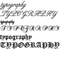
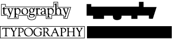
You have read a,b,c's by the trillion, words by the billion and pages by the million, but have you ever really stopped to consider the individual characters that make up a page? They have a personality, a flavor . . . they convey a mood or emotion. A particular typeface can provide inflection to the otherwise silent written page. It can actually shout frantically from the page, sing harmoniously or just whisper its message to the reader. And it can certainly put you to sleep.

Typography Is A Design Tool

In this MTV generation, design is certainly more visually graphic. Pictures are worth a thousand words, the old adage goes, but words are still important and carry the essence of the message. If we look back to thousands of years ago, all we have are pictures, from the pictograms from the caves in Altimera to the phonograms from the Egyptian hieroglyphics. Unfortunately, without the benefit of written language, it is difficult to understand exactly what these pictures really are saying. So type on the page is ultimately the most important element of any graphic design.

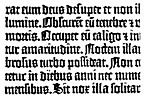
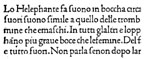
Typographic style has evolved along with the printing technology used to create it. In the mid-1400s, Johann Gutenberg developed his moveable type matrices and the printing press. His typography mimicked the hand-written script of the scribes, known as black letter. His invention created a new industry and fanned the fuel of the Renaissance, ending the Middle Ages. With knowledge came invention and creation of new typefaces and styles.

The biggest change came when typographers turned to the classic Roman letters of antiquity and created the first Roman typeface, typical of today's serif face. Nicholas Jensen is credited with creating the first Roman foundry type.

Aldus Manutius, developed the first italic type and formed the Aldine Press which exerted great influence on typography in the 1500s.

If you look at most books, from paperback to bound volumes, the typeface used is of the book or regular weight serif variety. It is not good practice to use italic, decorative, black letter or script or even a bold Roman face in large blocks of copy. Comprehension tests have shown that readability declines. And NEVER NEVER set scripts or black letter and some decorative typefaces in ALL CAPS.

There are all sorts of dos and don'ts that apply to the proper use of type. A few will be covered below.

Line Length

In the real world of type and design (as opposed to typical WWW publishing), the length of the line is figured by the size of the type. (On the web, the designer must do some layout gymnastics to insure that type is contained in the right measure and cannot be governed by how wide the computer window is opened on one's monitor.) The general rule of thumb is for line length to be no more than 2 alphabets long, or around 50-60 characters in length. Another way to figure line length is to multiply the point size by 2 (with the multiplied size measured in picas). These rules must be altered slightly when using a typeface with a larger x-height (lines can be longer or leaded more) or with a small x-height such as a delicate script (lines should be shorter). Of course, script or other fancy faces are not appropriate for big blocks of type.

2 Alphabets

abcdefghijklmnopqrstuvwxyzabcdefghijklmnopqrstuvwxyz

60 Characters

abcdefghijklmnopqrstuvwxyzabcdefghijklmnopqrstuvwxyzabcdefgh

2 Times Point Size (12 pt type = 24 pica line length)


Proper line measure is related to the way people read, called saccades. The eye makes a fixation each quarter of a second and takes in a group of words, jumping then to the
next fixation. If the line is too long for the type size, the eye might lose its place when reading down to the next line. Conversely, length should not be too short, for it would create letterspacing and word spacing problems in justified text and a jerky reading experience.


Type Readability and Legibility

Type readability is the reader's ability to comprehend and identify the written word, sentences and paragraphs with ease. Readers use the shape of the word, in regards to
the x-height, ascenders and descenders, to help identify the word. That's why lower case is easier to read than all caps; there is no real shape to a word written in capital letters.