
|
The first statement is certainly an area which deserves the attention of any author or designer of a document prepared for publishing, regardless of the medium. The second statement serves to simplify the structure or format design of any document. Kind Type-KindsActually, the two thoughts about two kinds of type above are not exclusive of each other but actually synthesize as one underlying rule. What is Typography Any letter or group of letters designed with common repeating elements; a general look and feel that tie all characters together Type Classifications There are thousands of typefaces on the market today, some based on the classics of the past such as Caslon, Goudy, Bodoni, Garamond, etc., hundreds from reputable type "foundries" and others created by desktop publishers. The quality of the typography available runs from excellent to horrible and care should be taken by the designer to chose a type face that has acceptable kerning and proportions. |
|||||||||||||||
 |
|||||||||||||||
 |
|||||||||||||||
 |
|||||||||||||||
 |
|||||||||||||||
 |
|||||||||||||||
 |
|||||||||||||||
 |
|||||||||||||||
Type Letter TermsType, like anything with physical form, has a particular anatomy, each letter having similar and different parts and strokes. Type size is measured in points, a system standardized by Pierre Fournier in the 1700s. The pica-point system as compared to the inch allows 6 points to an inch, 12 points to a pica, and 72 points to an inch. Type is measured from the top of the ascender to the bottom of the descender. A line of type with both Capitals, ascenders and descenders of 72 point would measure close to an inch high. A capital letter, however, is about 2/3rds as high as the total point size. Therefore, a 72 point size capital 'A' would measure about 48 points in height. |
|||||||||||||||
 |
|||||||||||||||
|
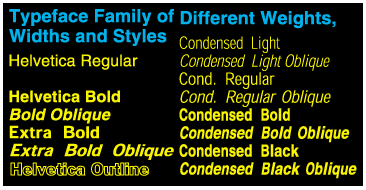
The term TYPE FACE, which comes from lead type terminology where the "face" of the type received the ink and made the impression, means the specific design of a set of letters, numbers and symbols. A typeface family is comprised of various weights and styles of a similar typeface. |
|||||||||||||||
 |
|||||||||||||||
|
The complete set of characters of a single typestyle, including upper and lowercase characters, numerals, punctuation, pi characters, etc. |
|||||||||||||||
 |
|||||||||||||||
|
The implied line that letters align themselves on horizontally. |
|||||||||||||||
 |
 |
||||||||
|
Capital The uppercase of the letters of the alphabet which sit on the baseline and extend to the height of the ascenders. |
X-Height The body height of letters from the baseline without the ascender. |
||||||||
 |
Ascender The part of a letter which extends above the x-height or x-line. |
 |
Descender The part of the letter that extends below the baseline. |
||||||
 |
Counter The space within convex letters. |
 |
Apex The points on some letters where strokes angle together. |
||||||
 |
Arm Horizontal or diagonal extensions on some letters. |
 |
Bar A horizontal line which crosses some letters at the midline. |
||||||
Type Word Terms |
|||||||||
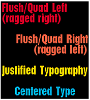 |
Justification The manner in which lines of type align to left or right margins. |
Tracking Selectively adding or subtracting spaces between all the letters on a line to lessen the impact of spaces between words (rivers |
|||||||||||||
| Kerning Deleting space between certain letter pairs with parallel diagonal strokes, such as As, Vs and Ws, or between characters such as T and o; to create a more even letter spacing. |
 |
Type Size Type is measured in point size. Line length is measured in picas. There are 6 picas per inch, 12 points per pica, and 72 points per inch. |
|||||||||||||
 |
|||||||||||||||
 |
|||||||||||||||
|
Leading A term that comes from hot type where actual strips of lead were put between the lines of cast type to increase the space between them; usually one or two extra points plus the actual point size of the type used. |
|||||||||||||||
|
||||||||||||||||||